
Project Overview: The Problem
For my UX Design Project, I wanted to understand how my peers can be better informed about the area they live in. As someone who has moved back and forth from Korea, this problem resonated with me because I currently struggle with this challenge. I’ve been told frequently by my friends that they wanted to be more aware of their surroundings and know more about what’s in their city. In order to remove bias from my problem space and research, I conducted user research within my school to get a better understanding of the root of the problem.
User Research
Before I start my user research, I wanted to pinpoint objectives to make sure I stay on track with the original problem.
My objectives were:
1. I want to understand how users become familiar with their areas
2. I want to understand how users interact with the services for navigation purposes
3. I want to know how my users would like to obtain the necessary information
4. I wanted to know which services users would like to see to better serve their needs
I conducted my user research by recruiting 4 diverse users for individual contextual interviews.
Contextual Interviews
Before asking specific questions, I wanted to get a better understanding of the problem space. I created an interview protocol that consisted of 3 sections: introduction, location search routine, location-based app usage, and positives & negatives of current experience.
I interviewed a total of 4 people.
Data Analysis
Once I finished the user research phase, I reviewed my interview notes and organized them into individual data points to create an affinity diagram.

My affinity diagram identified key points around different areas of the problem space, including the frequency of location-based app usage and important features users wish were available.
From here, I created a user journey map to understand the users’ pain points, positive experiences, and behaviors.

The Final People Problem
Based on the data analysis I conducted, I found that my users wanted to become more familiar with their areas by looking for food-related activities. Knowing what eateries are in their area helps them become more aware of their surrounding and allows them to connect with their friends by enjoying meals together.
This finding led me to my final people problem.
When people want to become familiar with their area, they look for highly-rated eateries. But they can’t do that well because:
- Searching for eateries is difficult on general search engines like Google
- Reviews are subjective, so it is difficult to rely on reviews
Brainstorming
Following the user research, I recruited 2 diverse individuals (people who I have not interviewed) to participate in a brainstorming session. The point of this exercise was to generate as many ideas as possible based on my final people problem.
From this exercise, I was able to narrow down the scope of my project to 6 possible solutions.
- Validation check for serious restaurant issues (essentially, bot removal)
- Personal restaurant score compared to an average score from consolidated rating on an app
- Detailed categorization
- Upvote comments (similar to what exists on Reddit)
- Personalization/Recommendations
- ‘My restaurant experience’ history
With the 6 possible solutions, I created a feasibility/impact matrix to see which solutions I could realistically move forward with for the MVP.
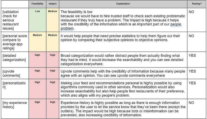
Based on this matrix, I picked 3 possible solutions to integrate into my design concept:
- Detailed Categorization
- Personalization/Recommendations
- ‘My restaurant experience’ history
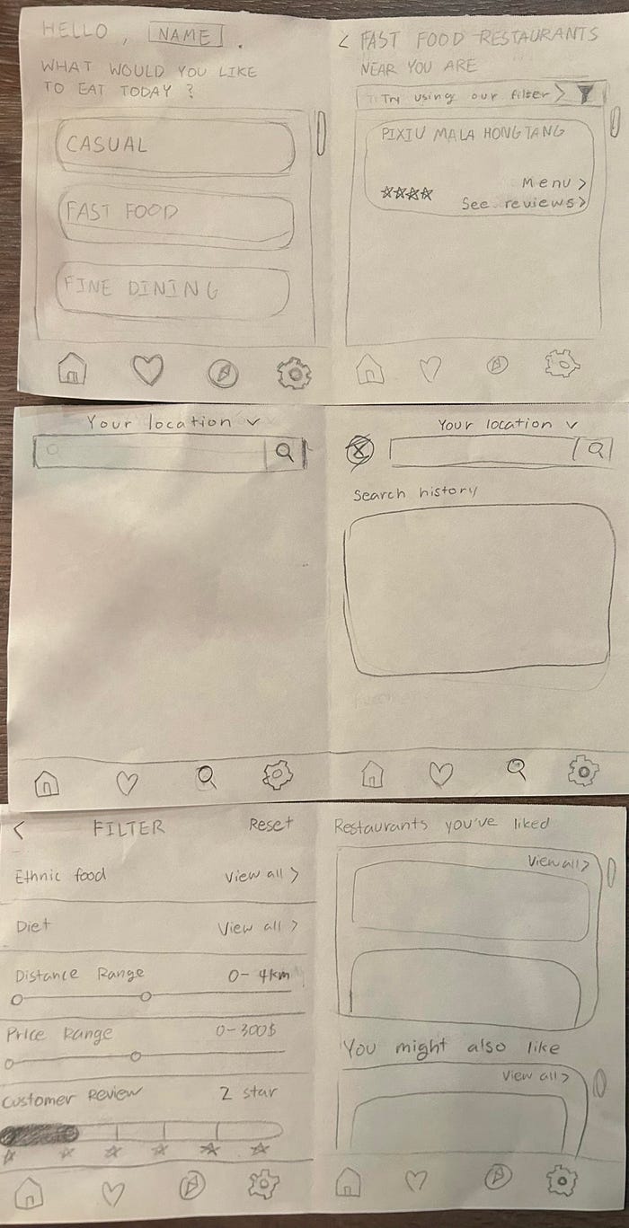
Low-Fidelity Sketches
I sketched my ideas with pencil and paper to provide a better visualization of the functions I could possibly implement for my final design. These sketches would also be used to conduct user interviews.
User Testing Round 1
To conduct my first round of user testing, I used the sketches to get general feedback on functionality and understand the natural thought process of users.
My goal for this set of user testing was to answer the following questions:
- Have I made the app detailed but simple enough to comprehend?
- Do all of the features seem necessary?
- Does the design support the searchability?
This was the feedback I received:
- The order of the features made it difficult for the users begin working through the sketches
- They requested forms/surveys on the app to enhance the personalization/recommendations feature I was trying to implement
- My users preferred a more simple and familiar, predictable design
- My users liked that search results were based on their taste profile
- My users didn’t like the amount of clicks it took for them to reach their goal
Mid-Fidelity Prototypes
Based on user feedback, I began wireframing on Figma. I digitized my sketches while incorporating the feedback I had received to take into consideration the new information I had received.
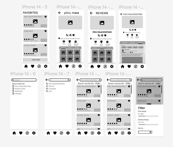
User Testing Round 2
For my second round of user testing, I used the mid-fidelity prototypes to get detailed feedback about specific task-oriented scenarios to understand what improvements need to be made. I also want to gather information on whether or not the workflows were easy to navigate.
This was the feedback I received:
- Users positively reacted to the categorization I showed in my prototype
- They liked the addition of the filters to the search functionality
- Users noted that the search functions were hidden and not easily detectable
- The information architecture of the overall design was better than my sketches, but it was not exactly intuitive
- They liked the layouts and the overall design
High-Fidelity Prototypes
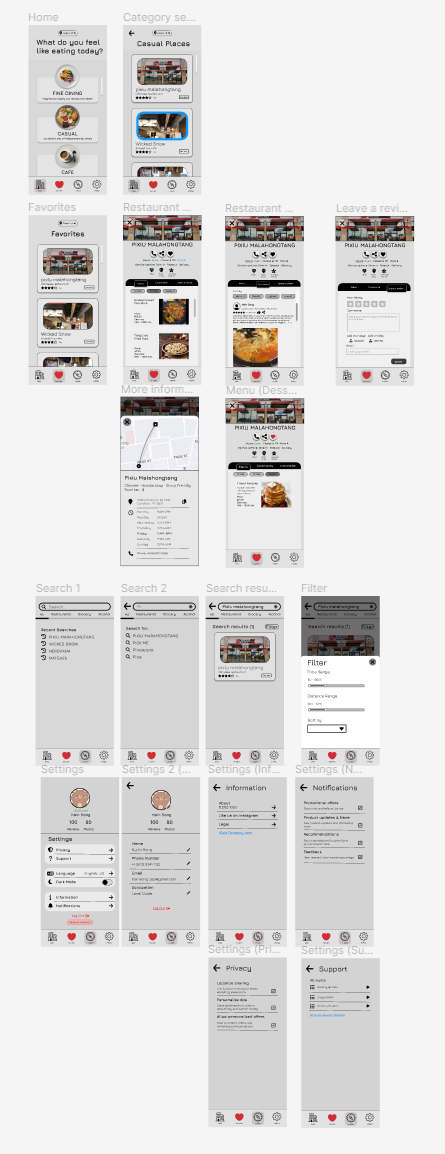
This prototype includes color, realistic scenarios with pictures, and more details that make the core functionality of the app stand out. I was aiming for a design that would be less complicated and more simplistic for users to use with ease.
View my high-fidelity prototype here.
Future Implications
I hope that users will enjoy and react positively to my final design concept. I still have yet to learn about aesthetics and ensuring that users feel comfortable navigating around the designs I create — but that is an adventure I look forward to.
The next steps after completing the final prototype would be to conduct usability testing and use the Nielsen heuristics to make sure that my final design concept passes the necessary checks to be the best possible solution for my problem space.